Social ToothPaste SEO Marketing Agency - subsidiary of Digital Broadcasting Corporation
Art of Designing Technical Brochures
Designing technical brochures requires a careful balance between clarity, visual appeal, and informative content. The goal is to convey complex technical information in an easily digestible format, using clear headings, concise descriptions, and visuals like diagrams or infographics to support the text. A well-designed brochure should have a clean, organized layout that guides the reader through the material, ensuring that key features and benefits are highlighted. It's essential to use a consistent color scheme, typography, and branding elements that reflect the company’s identity while ensuring the brochure is functional and accessible. High-quality images and an intuitive flow of information help make the content engaging without overwhelming the reader.
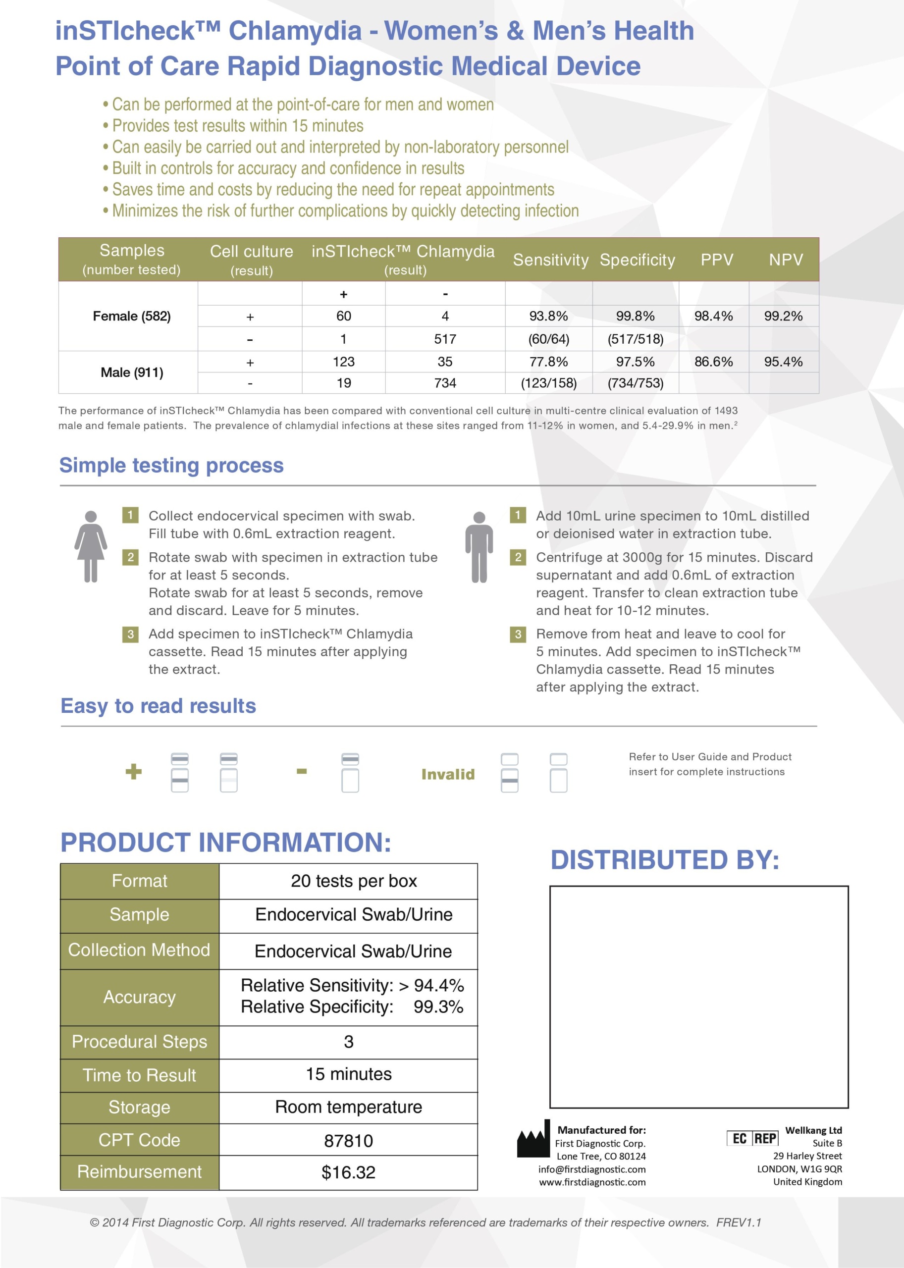
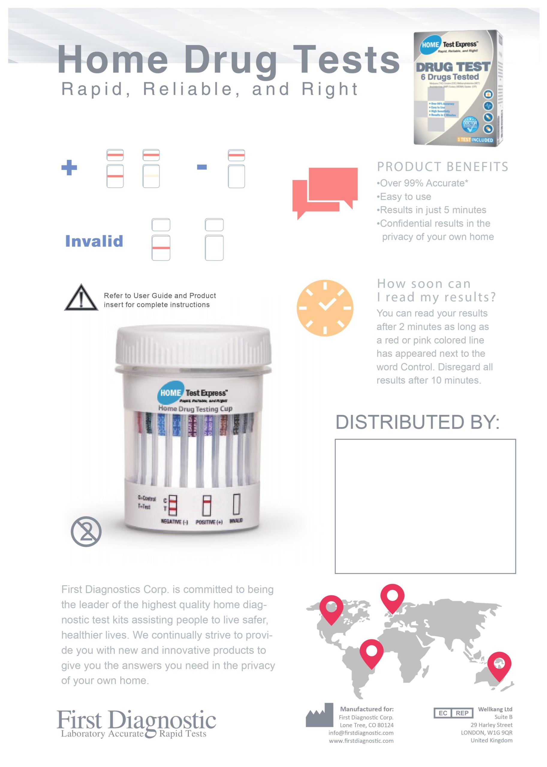
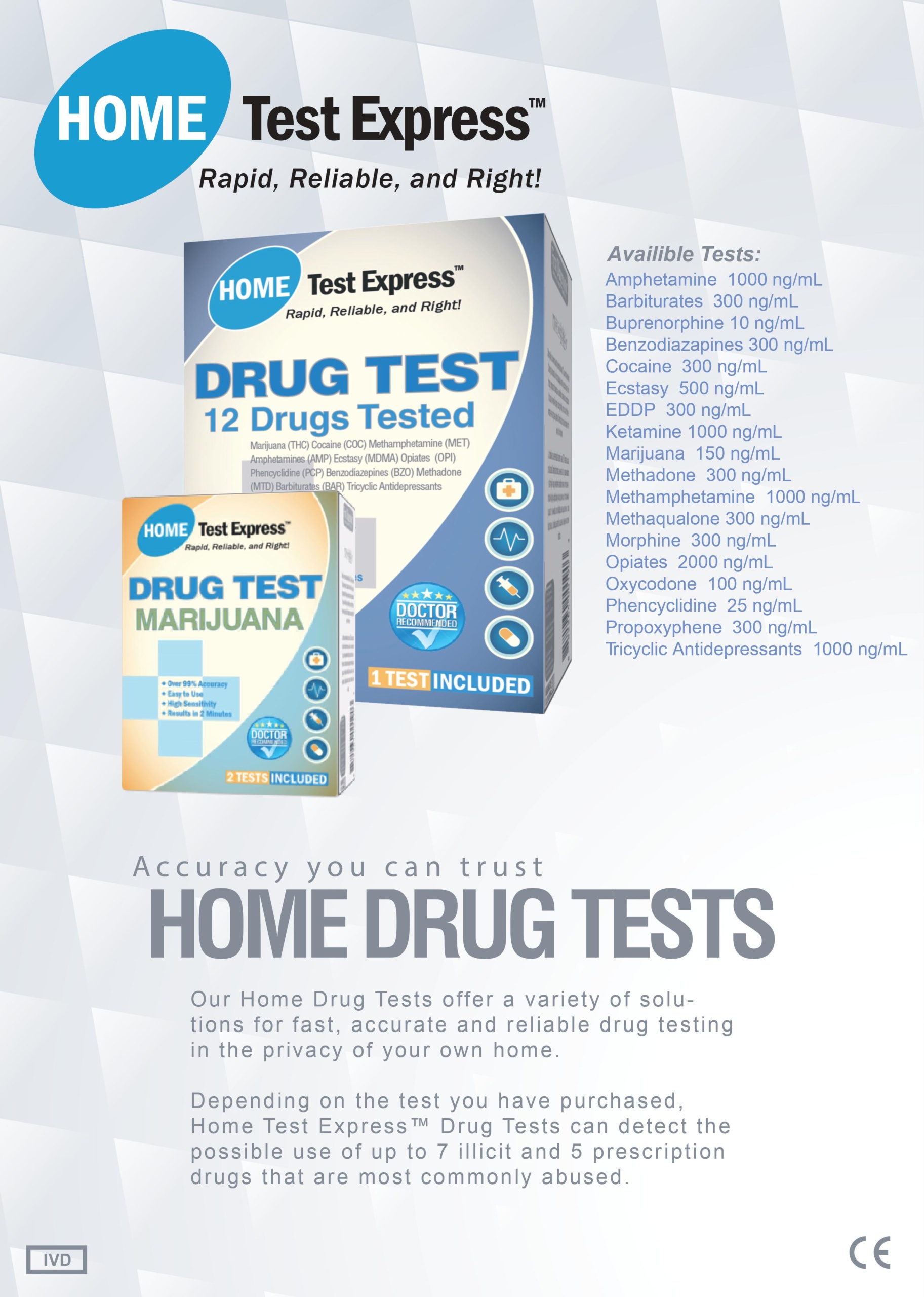
I designed these technical product brochures for First Diagnostic Corporation, which must adhere to strict FDA regulations.
Designing effective technical brochures requires a careful balance of clear communication, engaging visuals, and a user-friendly layout. Here’s a guide to creating impactful technical brochures:
1. Define Your Purpose and Audience
- Identify Objectives: What do you want to achieve with the brochure? Is it to inform, persuade, or promote a product?
- Know Your Audience: Tailor the content and design to the specific needs and interests of your target audience, whether they are engineers, technicians, or decision-makers.
2. Plan Your Content
- Technical Information: Present technical details, specifications, and features. Use bullet points and concise language for clarity.
- Benefits and Applications: Highlight how the technology or product can solve problems or improve processes for the audience.
- Visuals and Diagrams: Incorporate diagrams, charts, and images to complement the text and illustrate complex concepts.
3. Structure and Layout
- Logical Flow: Organize the brochure logically, starting with an introduction, then key information, and ending with a conclusion or call to action.
- Hierarchy of Information: Use headings, subheadings, and bullet points to create a clear hierarchy, which will make it easy for readers to scan the document.
- White Space: Utilize white space effectively to prevent overcrowding and enhance readability.
4. Visual Design
- Branding: Ensure the design aligns with your brand identity, using consistent colors, fonts, and logos.
- Professional Aesthetic: Opt for a clean and professional design that reflects the technical nature of the content.
- Infographics: Create infographics to represent complex data and make it more digestible visually.
5. Technical Accuracy
- Review and Edit: Ensure all technical information is accurate and up-to-date. If necessary, collaborate with subject matter experts.
- Proofreading: Check for grammatical errors and typos to maintain professionalism.
6. Print Quality and Format
- Quality Materials: Choose high-quality paper and printing options to reflect the professionalism of your brand.
- Size and Fold: Based on the amount of content and design preferences, decide on the size and fold of the brochure (tri-fold, bi-fold, etc.).
7. Call to Action
- Contact Information: Include precise contact details, including phone numbers, email addresses, and website links.
- Next Steps: Encourage readers to take action, whether visiting your website, contacting sales, or downloading additional resources.
8. Digital Versions
- PDF and Online Formats: Consider creating a digital version of the brochure for distribution via email or your website, making it easily accessible.
9. Feedback and Iteration
- Collect Feedback: After distributing the brochures, gather feedback from your audience to improve future editions.
- Iterate: Use insights gained to refine content and design for subsequent brochures.
Maximize Your ROI From Digital Marketing
![]()
Social Toothpaste, a niche Social Media Agency, is a cutting-edge digital media agency that drives marketing and branding success by pushing the limits of human story experiences and connecting your brand through innovative media, design, content, and technology. We craft strategies that elevate partner brand identification, ensuring they stand out in the digital landscape and achieve remarkable growth...
©2020 Social ToothPaste SEO Marketing Agency. All Rights Reserved.
